Car Rental Payment Error Notification
Project overview
This project is based off of a UX Writing challenge prompt from dailyuxwriting.com.
My role
UX Writer
Goal
The user is trying to rent a car using an application but the credit card on file has expired.
Challenge
Write them an error message so that they can correct the problem.
Headline: 30 characters
Body: 45 characters
Process
In doing competitor research, found an expired credit card in my own Hertz app account and updated it with the correct information. Hertz’s flow for updating a credit card on file offers very limited user guidance.
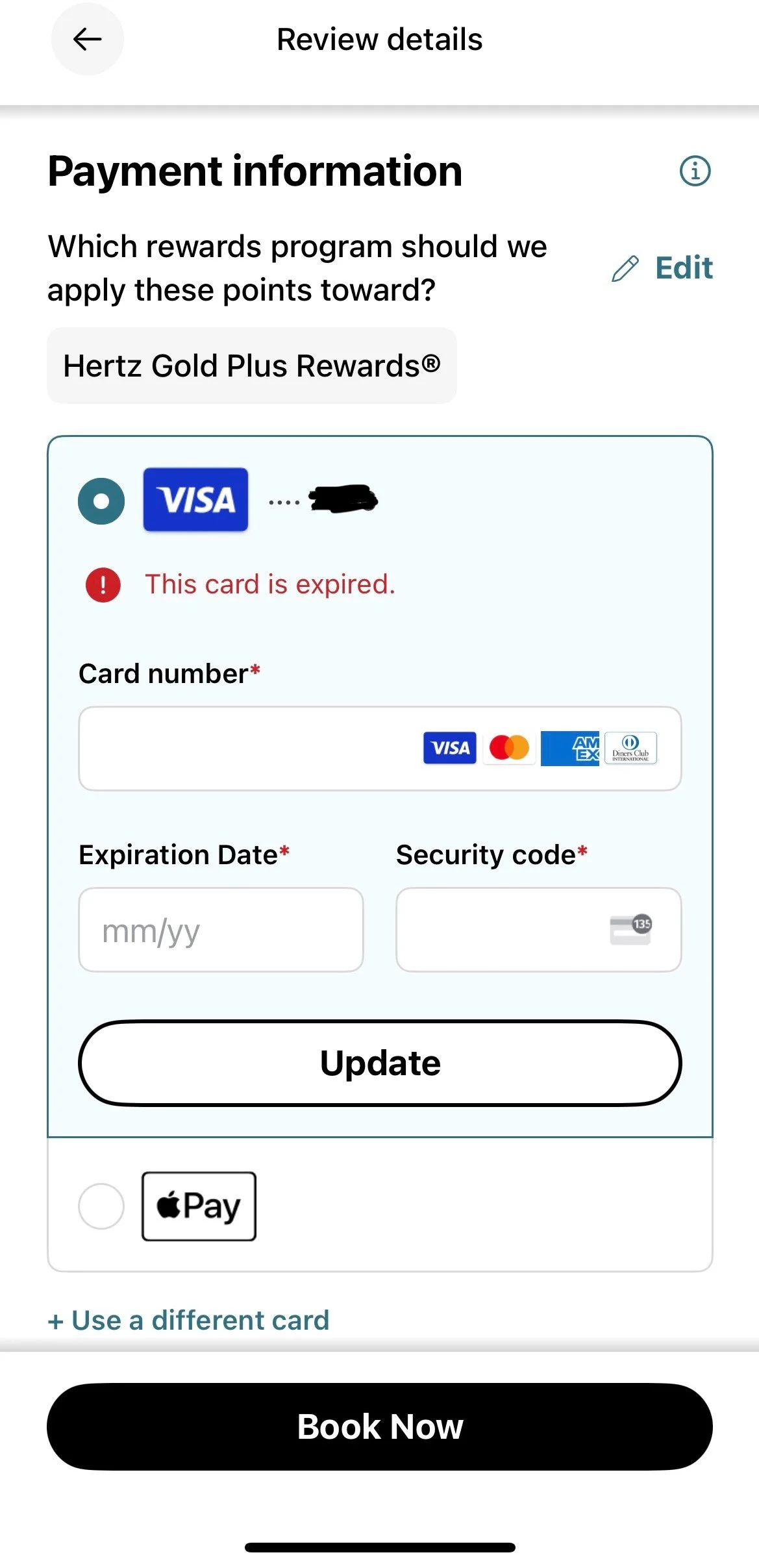
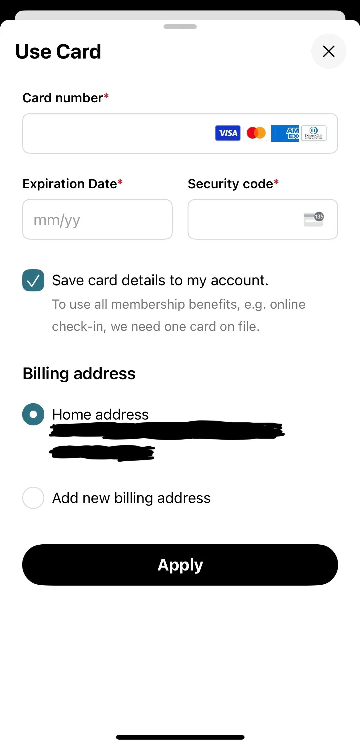
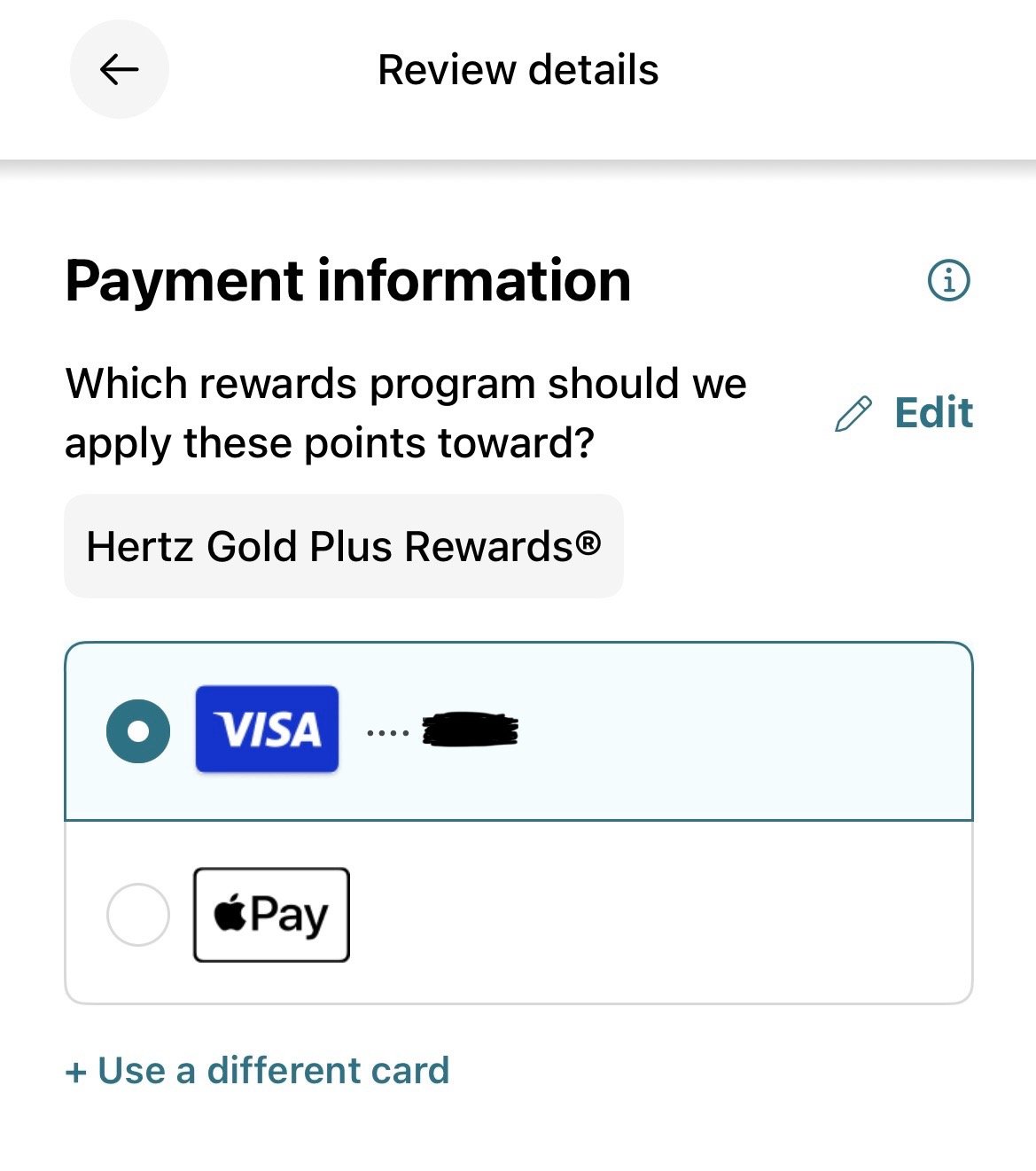
A very direct, bare bones approach to informing the user that their payment method is expired.Assessed the user’s potential emotions when receiving this error message (frustration, annoyance, fear, anxiety) by putting myself in their shoes (and even experiencing it myself when opening my Hertz app). Emotions around payment and financial ability can be sensitive topics for users.
Iterated different options with varying tone of voice, length, and options for the user
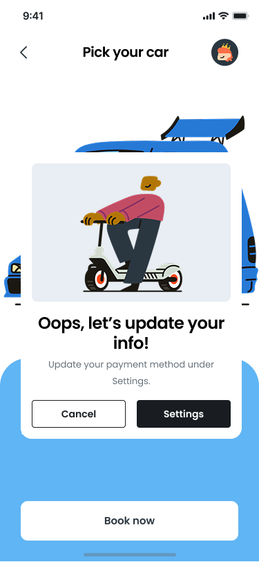
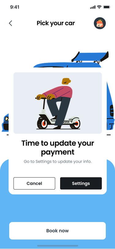
Option 1
Pros
The headline doesn’t sound off any alarms by gently telling the user to update their info
The body is clear in what info needs to be updated
The “Settings” button is a clear next step for the user to resolve the issue
Cons
While “oops” offers a casual and light tone, it doesn’t quite match the brand voice for a typical car rental company
If the user is quickly scanning this error message, it’s not exactly clear that their payment method is causing an issue since the CTA is to go to their Settings, which is where a variety of elements can be updated
Option 2
Pros
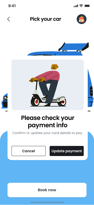
Headline is more clear about what element needs to be updated
Body text is concise about what next steps to take
Cons
It’s still not clear in the CTA button what exactly needs updating, which isn’t inherently confusing, but it could be more clear
Option 3
Pros
Headline is specific while also gentle in alerting the user of what the issue is
The body also offers a gentle nudge to the user to essentially double-check their credit card details to ensure they’re correct – while it’s likely that part of the info on file is incorrect, this gives the user a chance to re-confirm their payment method of choice
The CTA is much more clear in what needs to happen to finalize their reservation
Cons
Not necessarily a “con,” but “please” doesn’t necessarily offer too much value in this context where brevity is essential
In a monetization context, “to pay” can feel too transactional to a user
Solution
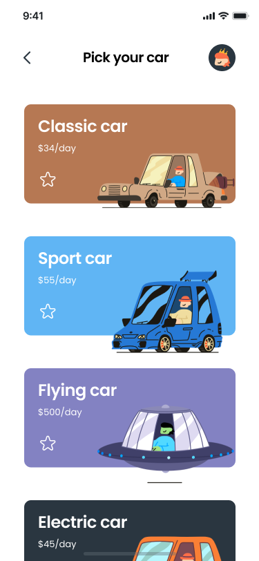
Car selection
Selected car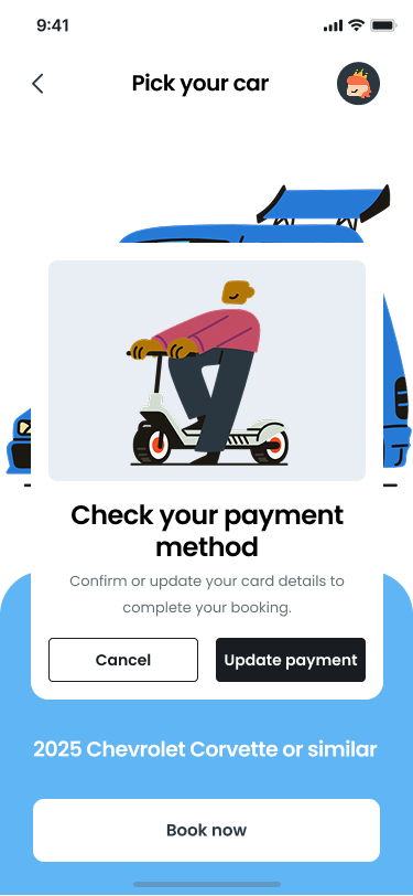
Payment errorError message is now more clear and concise in what the issue is and how the user needs to proceed to complete their car rental reservation. Prioritized empathy to how the user could react to a typical bold credit card expiration message, and chose a more gentle prompt. This approach serves as a pause in the booking process, and provides the user with a direct action step to confirm or update their payment method in order to continue.
Extra credit
Built out additional frames to show steps for updating existing credit card info.

User taps on expired Visa card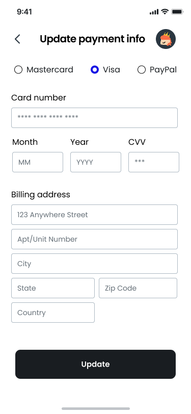
User updates Visa card info and selects [Update]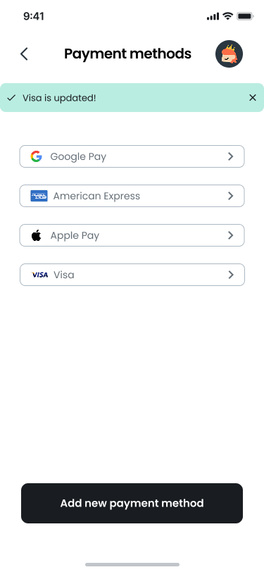
User can see that they have successfully updated their Visa card infoTakeaways
Saving a payment method is a convenience for the user’s future purchases. Any level of disruption can lead to the user feeling alarmed, worried, or vulnerable about what’s gone wrong and if they’ll receive their service
Stating in a matter-of-fact tone to check their existing payment info gives them the opportunity to confirm their details without causing immediate alarm
Providing direct, actionable steps allows the user to resolve the issue as soon as possible
Including clear visual banners confirms that the payment is successfully updated and that the user can proceed with their booking using that credit card info
Potential next steps
Work with a UX Designer on mapping out the full user flow
Update is successful:
Update Payment > Booking Confirmed
Payment is declined again:
Update Payment > Flag component that is being denied by bank (i.e. Credit Card Number, Expiration Date, CVV)
Payment is still declined:
Update Payment > Use a different payment method or contact your bank or support team
If this is the case, build out frame with clear, empathetic language to assure the user that no charges have been made
In the Update Payment frame:
Include text about payment processing timeline to assure user that they will not be charged until all payment info is correct
e.g. “You won’t be charged until the payment goes through successfully.”